design folio

Paris Hotel by Maison Martin Margiela

Anna Kidman - Saturday, July 23, 2011


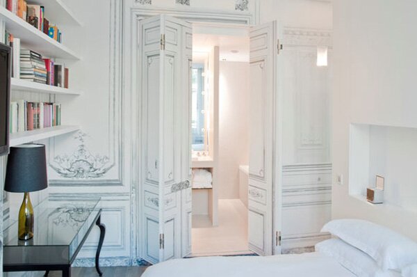
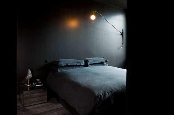
Who better to revamp the existing La Maison Champs Elysees hotel than design house Maison Martin Margiela. With two historic buildings making up the one hotel, it's a hotel of material juxtapositions. Margiela plays with light and dark, with some suites embracing tranquil white, and others, settling on a moody black colour scheme. The hotel explain that their aim was for 'Maison Martin Margiela [to create] a theatrical environment where reality and trompe-l'oeil blend into a surreal atmosphere.' Equipped with 17 guest suites, a restaurant, a smoking bar, and reception area, we're guessing this will be on the hit list for fashionistas and design enthusiasts alike.

Visit their site for more information.


Zip Tie Massimal

Anna Kidman - Friday, July 22, 2011


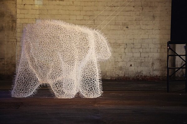
Design Office Takebayashi Scroggin (d.o.t.s.), based in the United States, has created the life size installation ‘zip tie massimal’. Made from 20,00 standard zip ties, the hollow creation, is based on a 1:1 scale of a real bear. When joined by its fellow animal counterparts, the animal abstraction is meant to mimic a docile petting zoo. The structure has been subtly stabilized through a cable suspension system connected to the ceiling.  The use of this unique material produces a glowing aura when illuminated. The silhouette of the bear is particularly striking through its realistic outline in an unnatural environment.

Story by Sarah McKenzie


The Story of Eames Furniture

Anna Kidman - Tuesday, July 19, 2011

from on .

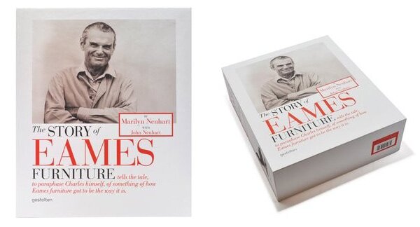
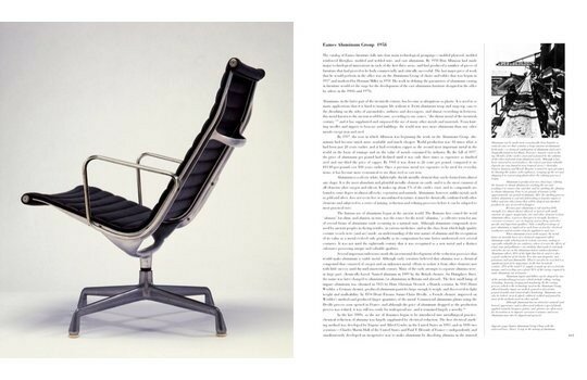
If you're going to read about the history of furniture, it may as well be an account on Charles and Ray Eames. This design duo between them produced not only some, but a good majority of the most famous design furniture pieces in the world. Their pieces are so popular in fact, it's continually disappointing to see them replicated badly at every turn. The book, brimming with images and insightful text, is a benchmark reference on what is arguably the most influential and important furniture of our time. Released last year by publisher Gelstalten, the book outlines many of the processes the duo went through in order to achieve perfect production. You can watch an interview with the author above and order the book here.

Authentic Eames furniture can be found locally at Matisse.


Shortcut by Boffi

Anna Kidman - Tuesday, July 19, 2011


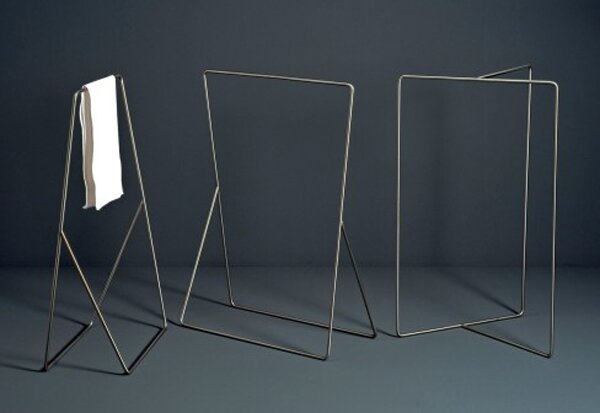
The shortcut towel holder by Nendo for Boffi, has just been awarded an honorable mention in the Compasso d'Oro awards - an awards programme set up by Italian architect Gio Ponti in 1954 that predominantly focuses on worthy Italian design. With its minimalist approach, its the perfect hybrid between these two enormously successful companies, feeling distinctively Nendo and Boffi-esque.

Boffi is available locally from here.


New Pieces by Tim Webber

Anna Kidman - Tuesday, July 19, 2011


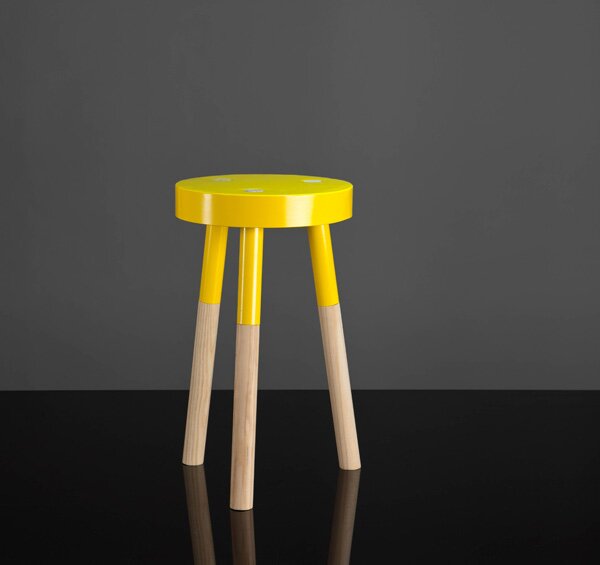
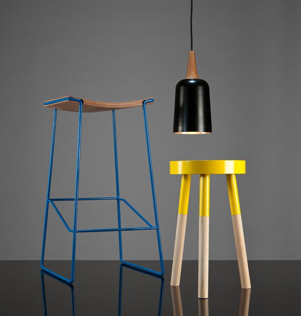
Young New Zealand designer Tim Webber is full of promise. As part of our Design Folio Incubator exhibition last year, he has since gone on to host his own exhibition at BoConcept earlier this year, and produced subsequent great designs. His work is diverse but often with a playful element where he utilises a careful use of colour. We're particularly liking these new pieces he's just sent through.


The Week in Review 19.7.2011

Anna Kidman - Tuesday, July 19, 2011
  

a. Paterson launched their newly renovated design showroom last Friday night in Auckland, showcasing the best from Grohe and Villeroy and Boch [paterson]
b. Vertical strip by Stephen Sobl [dezeen]
c. Shelter in the Swiss Alps by Preoneni Raffaele Scharer Architects [designboom]
d. Lernert & Sander: Natural Beauty [Nowness]
e. Photography: Dieter Rams House [Daily Icon]
f. Klipsch Mode Noise Cancelling Headphones [The Coolist]


Meltdown Chair by Tom Price

Anna Kidman - Tuesday, July 19, 2011
 

from on .

First spotted on a new design-art documentary site called Tales of the Hunt, this video documents the process of how Londoner Tom Price constructs his Meltdown chair. Comprised of a beach ball and mountains of rope, watch as he weaves his magic literally resulting in this futuristic chair. 


Paper Leica by Matt Nicholson

Claire Sullivan - Tuesday, July 19, 2011


Photographer Matt Nicholson has devised an alternative to the legendary Leica camera with his new project, a printable Paper Lie-ca M3 Pinhole Camera. Playing on the concept of making the desirable accessible, the paper camera is “just one of several functional products that represent status symbol objects everyone wants.”

Simply print out the design online, chop, fold and tape into shape, then add a role of film and you’re shooting pinhole-style photography. While it may not quite live up to the fidelity of its legendary namesake, this fully functional ‘Lei-ca’ camera will cost you the same as an A4 printout, so you’ve got nothing to lose by trying it out.

Story by Louisa Penney


‘Masters of Style: Celebrating The Stories Behind Italian Fashion‘

Claire Sullivan - Monday, July 18, 2011


Never has the expression 'Made in Italy' been so fitting for an embodiment of style and international flair. This month, Peroni Nastro Azzurro proves that nobody does it quite like the italians. The quintessential Italian lager house unites six of the world’s most iconic Italian style leaders in a unique photographic exhibition at Somerset House.

In recognition of the 150th anniversary of Italy as a unified nation, ‘Masters of Style: Celebrating The Stories Behind Italian Fashion‘ features imagery, alongside personal reflections and stories, from fashion greats Armani, Dolce & Gabbana, Ferragamo, Gucci, Missoni and Prada.

Curated by leading fashion commentator, Colin McDowell, the exhibition, made up of six individual pavilions, brings together a compelling collection that offers rare insight into some of the most significant members and defining moments in italian fashion.

Story by Louisa Penney


The Seed House by T3Arc

Claire Sullivan - Monday, July 18, 2011


Located in Jiutepec, Mexico amongst a vast terrain that previously homed Fichus trees, Casa La Semilla by architects T3Arc was designed around the idea of creating a house that would not impact on its natural surroundings. As a result, the previous tenants, the Fichus trees, have been utilized to their maximum advantage, making it difficult to determine the boundaries between inside and out. Constructed predominantly from concrete, the house covers 200sqm and is underpinned by three central columns and a single concrete beam that completely crosses them as an inverted pendulum. The surrounding trees are used to shelter the south sun (Jiutepec is a very hot area of the state of Morelos, Mexico) whilst simultaneously allowing a the space to maintain a completely open façade to them. With only a master bedroom and small room for a child, the rest of Casa La Semilla is open, allowing its inhabitants to live as close to possible to nature, amidst beautiful views of its lush landscape.

Story by Louisa Penney